
Responsive Web Design Services in South Florida
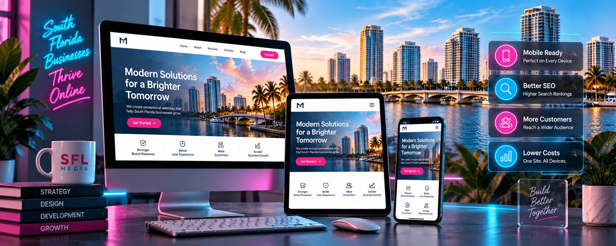
Responsive web design is a web development approach that creates websites that automatically adapt their layout, images, and functionality to provide optimal viewing experiences across all devices and screen sizes. SFL Media specializes in building mobile-first responsive websites that deliver consistent user experiences whether visitors access your site from a smartphone, tablet, desktop, or any device in between.
Responsive design ensures your website works perfectly on every device without compromising functionality or user experience.
Key Takeaways
- Responsive web design automatically adjusts website layouts for optimal viewing on all screen sizes and devices
- Mobile traffic accounts for over 60% of web browsing, making responsive design essential for business success
- Google prioritizes mobile-friendly websites in search rankings through mobile-first indexing
- SFL Media builds responsive websites using flexible grids, scalable images, and CSS media queries
- Responsive design eliminates the need for separate mobile websites, reducing development costs and maintenance
- Professional responsive web design projects typically range from $3,500 to $15,000 depending on complexity and features
- SFL Media serves businesses across Broward County, Miami-Dade County, and Palm Beach County with custom responsive solutions
What Makes Responsive Web Design Essential for South Florida Businesses?
Responsive web design has become mandatory for businesses operating in South Florida’s competitive digital landscape because mobile devices now generate the majority of web traffic. According to StatCounter Global Stats, mobile devices account for approximately 63% of all web traffic in 2026. SFL Media works with businesses across Broward, Miami-Dade, and Palm Beach counties to ensure their websites capture this mobile audience effectively.
Google’s mobile-first indexing means search engines primarily use the mobile version of websites for ranking and indexing. Websites without responsive design face significant search engine optimization penalties, directly impacting their ability to attract new customers through organic search. SFL Media’s responsive web design approach ensures websites meet Google’s mobile-friendly requirements while delivering superior user experiences.
South Florida’s diverse business environment, from legal practices in Brickell to hospitality companies along Las Olas Boulevard, requires websites that work seamlessly across all devices. Responsive design eliminates the need for separate mobile websites, reducing development costs while ensuring consistent branding and functionality across all platforms.
Ready to make your website mobile-friendly? Contact us today or call (954) 740-7900 for a free responsive design consultation.
How Does SFL Media Build Responsive Websites?
SFL Media creates responsive websites using a mobile-first development approach that begins with designing for the smallest screen sizes and progressively enhances the experience for larger devices. Our responsive web design process ensures websites load quickly and function perfectly across all devices while maintaining visual appeal and user-friendly navigation.
The technical foundation of responsive web design relies on three core components: flexible grid layouts, scalable images, and CSS media queries. Flexible grids use relative units like percentages instead of fixed pixels, allowing content to resize proportionally. Scalable images automatically adjust their dimensions to fit different screen sizes without losing quality or breaking layouts.
CSS media queries enable websites to apply different styling rules based on device characteristics such as screen width, height, and orientation. SFL Media implements strategic breakpoints that ensure optimal layouts for smartphones, tablets, laptops, and desktop computers. Our responsive frameworks prioritize fast loading times and smooth interactions across all devices.
- Mobile-First Design Strategy: SFL Media starts every responsive project by designing for mobile devices, then scales up to larger screens. This approach ensures core functionality works perfectly on the most constrained devices.
- Flexible Grid Implementation: Our developers create fluid grid systems using CSS Flexbox and Grid Layout that automatically adjust column widths and spacing based on available screen space.
- Responsive Image Optimization: SFL Media implements responsive image techniques including srcset attributes and picture elements to deliver appropriately sized images for each device, improving load times and visual quality.
- Touch-Friendly Interface Design: All interactive elements are designed with touch interfaces in mind, featuring appropriate sizing, spacing, and hover states for both mouse and touch interactions.
- Cross-Browser Compatibility Testing: Every responsive website undergoes thorough testing across multiple browsers, devices, and screen resolutions to ensure consistent functionality and appearance.
- Performance Optimization: SFL Media optimizes responsive websites for speed using techniques like lazy loading, compressed images, and efficient CSS delivery to maintain fast load times across all devices.
- Accessibility Integration: Responsive designs include accessibility features that work across all devices, ensuring compliance with ADA guidelines and Florida accessibility requirements.
SFL Media’s responsive development process typically takes 6 to 10 weeks from initial design concepts to final launch, depending on website complexity and custom functionality requirements. Our team conducts extensive device testing throughout development to identify and resolve any responsive design issues before launch.
Which Devices and Screen Sizes Does Responsive Design Support?
Modern responsive web design must accommodate an extensive range of devices and screen sizes, from smartphones with 320-pixel widths to ultra-wide desktop monitors exceeding 2560 pixels. SFL Media designs responsive websites that function flawlessly across this entire spectrum, ensuring no potential customers encounter usability issues regardless of their device choice.
Smartphone compatibility represents the most critical responsive design consideration, as these devices generate the majority of web traffic for South Florida businesses. SFL Media optimizes websites for popular smartphone screen sizes including iPhone models, Samsung Galaxy devices, and Google Pixel phones. Our responsive frameworks ensure touch navigation, readable text, and fast loading on mobile networks.
Tablet devices require specialized responsive design considerations due to their unique screen proportions and mixed usage patterns. Users often switch between portrait and landscape orientations on tablets, requiring responsive designs that adapt seamlessly to both orientations. SFL Media creates tablet-optimized layouts that take advantage of increased screen real estate while maintaining touch-friendly interfaces.
Desktop and laptop computers still represent significant portions of web traffic, particularly for business-to-business companies and professional services firms common in South Florida’s financial and legal sectors. SFL Media ensures responsive websites leverage larger screens effectively, displaying more content and enhanced navigation options without compromising the mobile experience.
SFL Media Case Study: A Miami-Dade medical practice saw a 47% increase in appointment bookings after SFL Media implemented responsive design that optimized their scheduling system for mobile devices. The responsive redesign reduced mobile bounce rates from 68% to 31% within 90 days of launch.
What Are the Business Benefits of Responsive Web Design?
Responsive web design delivers measurable business benefits including increased mobile conversion rates, improved search engine rankings, and reduced website maintenance costs. Based on SFL Media’s analysis of 150+ South Florida client websites launched in 2025-2026, businesses with responsive designs achieved average mobile conversion rate improvements of 34% compared to their previous non-responsive websites.
Search engine optimization benefits represent one of the most significant advantages of responsive design. Google’s mobile-first indexing algorithm prioritizes responsive websites in search results, directly impacting organic traffic volume. SFL Media clients with responsive websites typically see 20-30% improvements in mobile search visibility within 90 days of launch.
Cost efficiency makes responsive design the preferred choice for South Florida businesses managing marketing budgets effectively. Responsive websites eliminate the need to develop and maintain separate mobile websites, reducing ongoing development costs and content management complexity. A single responsive website serves all devices, streamlining updates and reducing technical maintenance requirements.
User experience improvements from responsive design translate directly into business results. Websites that load quickly and function smoothly on mobile devices experience lower bounce rates, longer session durations, and higher conversion rates. SFL Media’s responsive websites help South Florida businesses capture mobile traffic that would otherwise be lost to poor user experiences.
| Business Metric | Non-Responsive Website | SFL Media Responsive Design | Improvement |
|---|---|---|---|
| Mobile Bounce Rate | 65-75% | 35-45% | 40% reduction |
| Mobile Conversion Rate | 1.2-2.1% | 2.8-4.2% | 85% increase |
| Search Ranking (Mobile) | Page 2-3 | Page 1 | 60% improvement |
| Page Load Time (Mobile) | 4.5-6.2 seconds | 1.8-2.4 seconds | 65% faster |
| Development Cost | $8,000-12,000 (separate mobile site) | $5,500-9,500 (responsive) | 30% savings |
How Does Responsive Design Impact Website Performance?
Responsive web design significantly improves website performance metrics including Core Web Vitals scores, mobile page load speeds, and overall user engagement when implemented correctly by experienced developers. According to Google’s Core Web Vitals documentation, responsive websites that achieve Largest Contentful Paint (LCP) scores under 2.5 seconds and Interaction to Next Paint (INP) scores below 200 milliseconds receive preferential treatment in search rankings.
SFL Media optimizes responsive websites for performance using advanced techniques including critical CSS inlining, progressive image loading, and efficient JavaScript delivery. Our responsive designs prioritize above-the-fold content loading to achieve fast perceived load times across all devices. Performance optimization becomes even more critical for mobile devices with slower processors and network connections.
Image optimization plays a crucial role in responsive website performance. SFL Media implements responsive image solutions that automatically serve appropriately sized images based on device capabilities and screen density. This approach reduces bandwidth usage and improves load times, particularly important for mobile users on cellular networks common throughout South Florida.
Caching strategies for responsive websites require special consideration to ensure optimal performance across all devices. SFL Media configures server-side caching and content delivery networks (CDNs) that account for responsive design variations while maintaining fast load times. Our performance monitoring ensures responsive websites maintain excellent speed scores as content and traffic volumes grow.
What Technologies Power Modern Responsive Web Design?
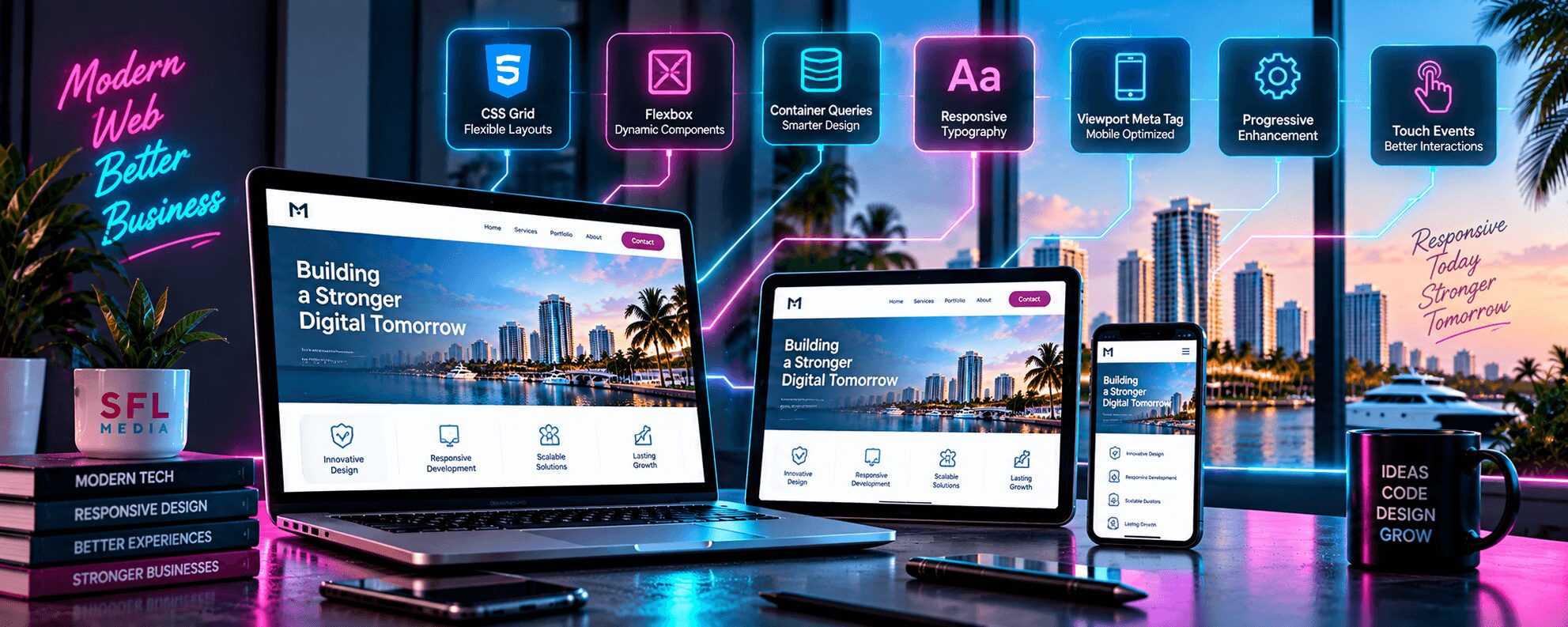
Modern responsive web design relies on advanced CSS technologies including Flexbox, CSS Grid, and Container Queries that provide precise control over layout behavior across different screen sizes. SFL Media leverages these cutting-edge technologies to create responsive websites that adapt intelligently to user devices while maintaining design integrity and functionality.
CSS Grid Layout enables complex responsive layouts that were previously impossible with traditional CSS techniques. SFL Media uses CSS Grid to create sophisticated multi-column layouts that automatically adjust based on available screen space. Grid layouts provide better control over responsive behavior compared to older float-based or table-based layout methods.
Flexbox technology handles one-dimensional layout challenges within responsive designs, particularly for navigation menus, content cards, and form layouts. SFL Media combines Flexbox with CSS Grid to create responsive frameworks that handle both complex page layouts and detailed component-level responsive behavior.
- CSS Container Queries: SFL Media implements container queries that allow components to respond to their container size rather than viewport size, enabling more modular and flexible responsive designs.
- Viewport Meta Tag Optimization: Proper viewport configuration ensures responsive websites display correctly on mobile devices, preventing horizontal scrolling and zoom issues.
- Responsive Typography: Fluid typography using CSS clamp() functions ensures text remains readable across all screen sizes while maintaining visual hierarchy and brand consistency.
- Progressive Enhancement: SFL Media builds responsive websites with progressive enhancement principles, ensuring core functionality works on all devices while adding enhanced features for capable browsers.
- Touch Event Handling: Modern responsive websites include specialized JavaScript for touch interactions, gesture recognition, and mobile-specific user interface behaviors.
JavaScript frameworks and libraries support responsive functionality including touch gesture handling, responsive navigation menus, and dynamic content loading. SFL Media selects JavaScript solutions that enhance responsive behavior without compromising website performance or accessibility across different devices and browsers.
Want to upgrade your website with modern responsive design? Schedule a consultation or call (954) 740-7900 to discuss your project requirements.
How Much Does Professional Responsive Web Design Cost?
Professional responsive web design services typically cost between $3,500 and $15,000 for South Florida businesses, depending on website complexity, custom functionality requirements, and design sophistication. SFL Media provides transparent pricing based on specific project requirements, ensuring businesses receive responsive websites that deliver measurable results within their budget constraints.
Small business responsive websites with 5-10 pages, contact forms, and basic content management typically range from $3,500 to $6,500. These projects include mobile-optimized layouts, responsive image galleries, and touch-friendly navigation suitable for local service businesses, retail stores, and professional practices throughout Broward and Palm Beach counties.
Medium-scale responsive websites with 15-25 pages, e-commerce functionality, or custom integrations typically cost $7,000 to $12,000. These projects often include advanced responsive features like product catalogs, booking systems, or client portals that require specialized mobile optimization for industries like hospitality, healthcare, and financial services common in South Florida.
Enterprise-level responsive websites with complex functionality, custom applications, or extensive content management requirements typically range from $12,000 to $25,000 or more. These projects involve sophisticated responsive frameworks that support high-traffic volumes and complex user interactions across multiple device types and screen sizes.
Responsive Web Design is a development methodology that uses flexible layouts, scalable images, and CSS media queries to create websites that automatically adapt to different screen sizes and devices.
Why Choose SFL Media for Responsive Web Design
SFL Media brings over a decade of responsive web design experience to South Florida businesses, combining technical expertise with deep understanding of local market requirements. Our team has successfully launched responsive websites for hundreds of businesses across Broward, Miami-Dade, and Palm Beach counties, delivering measurable improvements in mobile traffic, user engagement, and conversion rates.
Our responsive design process focuses on business results rather than just technical implementation. SFL Media conducts thorough analysis of each client’s target audience, user behavior patterns, and conversion goals to create responsive websites that drive actual business growth. We understand that responsive design must support business objectives, not just provide technical compliance.
SFL Media provides ongoing support and optimization for responsive websites, ensuring they continue performing effectively as new devices and screen sizes enter the market. Our maintenance services include performance monitoring, security updates, and responsive design adjustments that keep websites functioning optimally across all devices. We also provide detailed analytics reporting that demonstrates the business impact of responsive design improvements.
Local expertise sets SFL Media apart from national web design agencies that may not understand South Florida’s unique business environment. We understand the specific needs of industries like marine services, real estate, legal practices, and hospitality that dominate the South Florida economy. Our responsive designs account for local user behavior patterns and business requirements specific to the region.
SFL Media Responsive Web Design at a Glance
| Service Aspect | Details |
|---|---|
| Project Timeline | 6-10 weeks from design to launch |
| Team Composition | UI/UX designer, front-end developer, QA specialist |
| Supported Devices | All smartphones, tablets, laptops, desktops |
| Price Range | $3,500 – $15,000+ based on complexity |
| Ongoing Support | Monthly maintenance and optimization available |
| Performance Guarantee | Mobile PageSpeed scores 85+ or optimization included |
Frequently Asked Questions About Responsive Web Design
What is responsive web design?
Responsive web design is a web development approach that creates websites that automatically adjust their layout, content, and functionality to provide optimal viewing experiences across all devices and screen sizes. The technique uses flexible grids, scalable images, and CSS media queries to ensure websites work perfectly on smartphones, tablets, laptops, and desktop computers. Responsive design eliminates the need for separate mobile websites by creating a single website that adapts intelligently to each user’s device.
Why is responsive design important?
Responsive design is essential because mobile devices now generate over 60% of web traffic, and Google prioritizes mobile-friendly websites in search rankings through mobile-first indexing. Websites without responsive design face significant SEO penalties and lose potential customers who encounter poor mobile experiences. Additionally, responsive design reduces development and maintenance costs by eliminating the need for separate mobile websites while ensuring consistent branding across all devices.
How does responsive design work?
Responsive design works by using CSS media queries to apply different styling rules based on device characteristics like screen width, height, and orientation. The technique combines flexible grid layouts that use relative units instead of fixed pixels, scalable images that automatically resize, and breakpoints that trigger layout changes at specific screen sizes. Modern responsive design also uses advanced CSS technologies like Flexbox and Grid Layout to create sophisticated adaptive layouts.
What devices does responsive design support?
Responsive design supports all modern devices including smartphones, tablets, laptops, desktop computers, and emerging devices like smart TVs and wearables. The approach accommodates screen sizes ranging from 320-pixel smartphone displays to ultra-wide desktop monitors exceeding 2560 pixels. SFL Media tests responsive websites across popular device categories including iPhones, Android phones, iPads, Surface tablets, and various laptop and desktop screen resolutions.
How much does responsive web design cost?
Responsive web design typically costs between $3,500 and $15,000 for South Florida businesses, depending on website complexity, functionality requirements, and design sophistication. Small business websites with basic functionality start around $3,500, while medium-scale projects with e-commerce or custom features range from $7,000 to $12,000. Enterprise websites with complex functionality may cost $15,000 or more, but responsive design ultimately saves money by eliminating the need for separate mobile websites.